Color Theory and Palette Generation: Complete Design Guide
Understanding Color Theory
Color theory is the science and art of using color. It explains how humans perceive color, how colors mix, match, or clash, and the messages colors communicate. Understanding color theory is essential for creating effective designs, whether for web interfaces, print materials, or any visual medium.
The Color Wheel and Color Models
Primary, Secondary, and Tertiary Colors
Primary Colors: Red, Blue, and Yellow (in traditional color theory) or Red, Green, and Blue (in digital/light-based color theory)
- These colors cannot be created by mixing other colors
- All other colors are derived from these
Secondary Colors: Created by mixing two primary colors
- Orange (Red + Yellow)
- Green (Blue + Yellow)
- Purple (Red + Blue)
Tertiary Colors: Created by mixing a primary and secondary color
- Red-Orange, Yellow-Orange, Yellow-Green, Blue-Green, Blue-Purple, Red-Purple
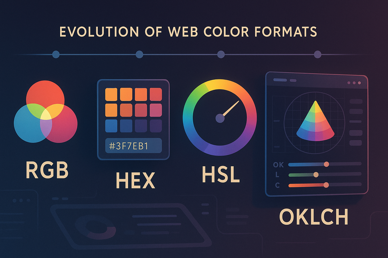
Digital Color Models
RGB (Red, Green, Blue)
- Use Case: Digital displays, web design, photography
- Values: Each channel ranges from 0-255
- Example:
rgb(255, 87, 51) for a vibrant orange
- Additive Model: Colors get lighter when combined
HSL (Hue, Saturation, Lightness)
- Hue: The color itself (0-360 degrees on color wheel)
- Saturation: Color intensity (0-100%)
- Lightness: How light or dark the color is (0-100%)
- Example:
hsl(14, 100%, 60%) for the same orange
- Advantage: More intuitive for designers
OKLCH (Lightness, Chroma, Hue)
- Modern Model: Perceptually uniform color space
- Lightness: 0-1 (black to white)
- Chroma: Color intensity (0-0.37+)
- Hue: 0-360 degrees
- Advantage: Better color accuracy across devices
Color Harmony Methods
Our tool uses scientifically-proven color harmony methods to generate pleasing color combinations:
1. Monochromatic Harmony
Concept: Uses variations of a single hue with different saturations and lightness values.
How it works:
- Takes your base color
- Generates lighter tints (adding white)
- Creates darker shades (adding black)
- Adjusts saturation for tones
Best for:
- Minimalist designs
- Creating calm, cohesive looks
- Emphasizing content over color
- Professional/corporate designs
Example: Starting with blue #3498db, generates: #5dade6, #87c3f0, #2980b9, #1f5582
2. Analogous Harmony
Concept: Uses colors that are adjacent to each other on the color wheel (within 30 degrees).
How it works:
- Takes your base hue
- Selects colors 15-30 degrees apart
- Maintains similar saturation and lightness
- Creates natural, flowing color transitions
Best for:
- Nature-inspired designs
- Peaceful, harmonious interfaces
- Gradients and backgrounds
- Themes requiring visual flow
Example: Starting with green #27ae60, generates colors ranging from yellow-green to blue-green
3. Complementary Harmony
Concept: Uses colors directly opposite each other on the color wheel (180 degrees apart).
How it works:
- Identifies the complement of your base color
- Creates high contrast combinations
- Balances warm and cool colors
- Generates attention-grabbing palettes
Best for:
- Call-to-action buttons
- Highlighting important elements
- Sports team colors
- Dynamic, energetic designs
Example: Red #e74c3c paired with green #2ecc71
4. Triadic Harmony
Concept: Uses three colors evenly spaced around the color wheel (120 degrees apart).
How it works:
- Starts with your base color
- Finds two colors at 120° intervals
- Creates vibrant, balanced palettes
- Maintains visual interest while staying harmonious
Best for:
- Playful, vibrant designs
- Children's interfaces
- Creative portfolios
- Illustrations and artwork
Example: Starting with red, includes blue and yellow for a primary color scheme
5. Tetradic (Rectangle) Harmony
Concept: Uses four colors arranged in two complementary pairs.
How it works:
- Takes your base color and its complement
- Adds another color and its complement
- Creates rich, complex palettes
- Offers maximum color variety
Best for:
- Complex interfaces with many elements
- Rich, sophisticated designs
- Applications requiring diverse color coding
- Artistic and expressive designs
6. Random Generation
Concept: Generates colors using algorithmic randomness with aesthetic constraints.
How it works:
- Uses color theory principles as guardrails
- Ensures sufficient contrast and readability
- Applies golden ratio and other mathematical principles
- Balances randomness with visual appeal
Best for:
- Creative inspiration
- Exploring unexpected combinations
- Breaking out of design comfort zones
- Generating fresh ideas
Color Psychology and Emotions
Warm Colors (Red, Orange, Yellow)
- Emotions: Energy, excitement, warmth, comfort
- Use Cases: Call-to-action buttons, food brands, urgent notifications
- Cultural Notes: Can signify good luck (red in China) or caution (yellow universally)
Cool Colors (Blue, Green, Purple)
- Emotions: Calm, trust, stability, professionalism
- Use Cases: Financial services, healthcare, technology brands
- Cultural Notes: Blue is trusted globally, green represents nature and growth
Neutral Colors (Gray, Brown, Beige, Black, White)
- Emotions: Sophistication, timelessness, minimalism
- Use Cases: Typography, backgrounds, luxury brands
- Benefits: Allow other colors to stand out, improve readability
Technical Implementation in Design
CSS Color Properties
:root {
--primary: #3498db;
--secondary: #e74c3c;
--accent: #f39c12;
--background: #ecf0f1;
--text: #2c3e50;
}
.modern-color {
color: oklch(0.7 0.15 180);
background: oklch(0.9 0.05 180);
}
Accessibility Considerations
When generating palettes, always check:
WCAG Contrast Ratios:
- AA Normal Text: 4.5:1 minimum
- AA Large Text: 3:1 minimum
- AAA Normal Text: 7:1 minimum
Color Blindness Testing:
- Test with Deuteranopia (green-blind)
- Test with Protanopia (red-blind)
- Test with Tritanopia (blue-blind)
- Ensure information isn't conveyed through color alone
Color Format Conversions
Our tool provides multiple formats for maximum compatibility:
HEX to RGB Conversion
function hexToRgb(hex) {
  const r = parseInt(hex.slice(1, 3), 16);
  const g = parseInt(hex.slice(3, 5), 16);
  const b = parseInt(hex.slice(5, 7), 16);
  return `rgb(${r}, ${g}, ${b})`;
}
RGB to HSL Conversion
function rgbToHsl(r, g, b) {
r /= 255; g /= 255; b /= 255;
const max = Math.max(r, g, b);
const min = Math.min(r, g, b);
let h, s, l = (max + min) / 2;
return `hsl(${h}, ${s}%, ${l}%)`;
}
Advanced Palette Techniques
Creating Semantic Color Systems
Primary Palette: 3-5 main brand colors
- Brand primary (logo, main CTAs)
- Brand secondary (accents, highlights)
- Neutral base (backgrounds, borders)
Functional Palette: Colors with specific meanings
- Success (green):
#27ae60
- Warning (yellow):
#f39c12
- Error (red):
#e74c3c
- Info (blue):
#3498db
Tonal Variations: 5-9 shades of each color
- 50 (lightest tint)
- 100, 200, 300, 400 (lighter variations)
- 500 (base color)
- 600, 700, 800, 900 (darker variations)
Color Temperature and Mood
Warm Palettes (Red-biased):
- Create energy and urgency
- Stimulate appetite (restaurants)
- Convey passion and excitement
Cool Palettes (Blue-biased):
- Promote trust and calm
- Suggest professionalism
- Work well for technology brands
Balanced Palettes:
- Mix warm and cool colors
- Create visual interest
- Suit diverse content types
Industry-Specific Color Applications
Web Design
- Hero Sections: Bold, attention-grabbing primaries
- Navigation: High-contrast, accessible colors
- Content: Neutral backgrounds with colorful accents
- Interactive Elements: Clear state changes (hover, active, disabled)
Brand Identity
- Logo Colors: Memorable, reproducible across media
- Marketing Materials: Consistent with brand personality
- Packaging: Colors that stand out on shelves
- Digital Assets: Optimized for screens and social media
User Interface Design
- Information Hierarchy: Colors to guide user attention
- Feedback Systems: Clear success/error states
- Dark/Light Modes: Adaptable color schemes
- Component Libraries: Systematic color tokens
Cultural Considerations
Global Color Meanings
- Red: Luck (China), Danger (West), Purity (India when mixed with white)
- White: Purity (West), Death/Mourning (East Asia)
- Green: Nature (Global), Islam (Middle East), Money (USA)
- Blue: Trust (Global), Sadness (West), Immortality (China)
Inclusive Design
- Consider color blindness (8% of men, 0.5% of women)
- Test across different cultural contexts
- Provide non-color alternatives for important information
- Use patterns or icons alongside colors
Tools and Workflow Integration
Design Software Integration
Adobe Creative Suite:
- Export palettes as .ase files
- Sync across Photoshop, Illustrator, InDesign
Figma/Sketch:
- Save as color styles
- Share via design systems
- Use plugins for palette generation
Development Handoff:
- CSS custom properties
- Design tokens (JSON format)
- Style guide documentation
Testing and Validation
Accessibility Tools:
- WebAIM Contrast Checker
- Color Oracle (color blindness simulator)
- Stark (Figma plugin)
Cross-Device Testing:
- Different monitor calibrations
- Mobile device screens
- Print color accuracy
Color Trends and Future-Proofing
Current Design Trends
- Gradients: Smooth color transitions
- Duotones: Two-color photo treatments
- Neon Accents: Bright, saturated highlights
- Earth Tones: Natural, sustainable palettes
Future Considerations
- Display Technology: HDR, wide gamut displays
- Dark Mode: Designing for both light and dark interfaces
- Personalization: User-customizable color schemes
- Accessibility: Increasingly important for inclusive design
Best Practices Summary
Do's
✅ Test colors at different sizes and contexts
✅ Maintain consistent color usage across platforms
✅ Consider accessibility from the start
✅ Use color to support, not replace, clear information hierarchy
✅ Document your color decisions and rationale
Don'ts
❌ Use color as the only way to convey information
❌ Choose colors based solely on personal preference
❌ Ignore cultural contexts for global products
❌ Use too many colors (5-7 is usually maximum)
❌ Forget to test on actual devices and conditions
Mathematical Foundations
Golden Ratio in Color
The golden ratio (1.618) can be applied to color relationships:
- Hue intervals: 137.5° (360° ÷ 1.618)
- Saturation relationships: 62% and 38%
- Lightness proportions in gradients
Color Distance Calculations
function deltaE(lab1, lab2) {
const deltaL = lab1.l - lab2.l;
const deltaA = lab1.a - lab2.a;
const deltaB = lab1.b - lab2.b;
return Math.sqrt(deltaL*deltaL + deltaA*deltaA + deltaB*deltaB);
}
Understanding these principles will help you create more effective, accessible, and beautiful color palettes for any design project. Our color palette generator implements these theories to ensure your generated palettes are both aesthetically pleasing and functionally effective.